Your brand is more than a logo. It's how your audience perceives you across every touchpoint. This chapter covers how to define and align your verbal and visual identity.
Social Media Fundamentals
5 min read
Table of contents
Defining a social media strategy
Implementing a strategy
Company page fundamentals
Growing your audience
Design templates
Leveraging your employees
Social media analytics
LinkedIn Ads
Google My Business
Bonus: Website basics
What is verbal and visual branding?
Your brand is more than a logo. It's how your audience perceives you: the feeling they get when they see your content, the tone they hear in your captions, the colours they associate with your company. Verbal and visual branding is about making these elements intentional and consistent.
This takes time. Strong brands aren't built in a week. They're built through consistent repetition of the same voice, style, and message across every touchpoint, from your LinkedIn posts to your website to your email signature.
Your verbal brand
Your verbal brand is the way you communicate: the words you choose, the tone you use, and the personality that comes through in your writing.
Start by defining your brand persona. If your company were a person, how would they speak? Are they formal or conversational? Technical or plain-spoken? Warm or matter-of-fact? The answer should match your audience's expectations and your company's culture.
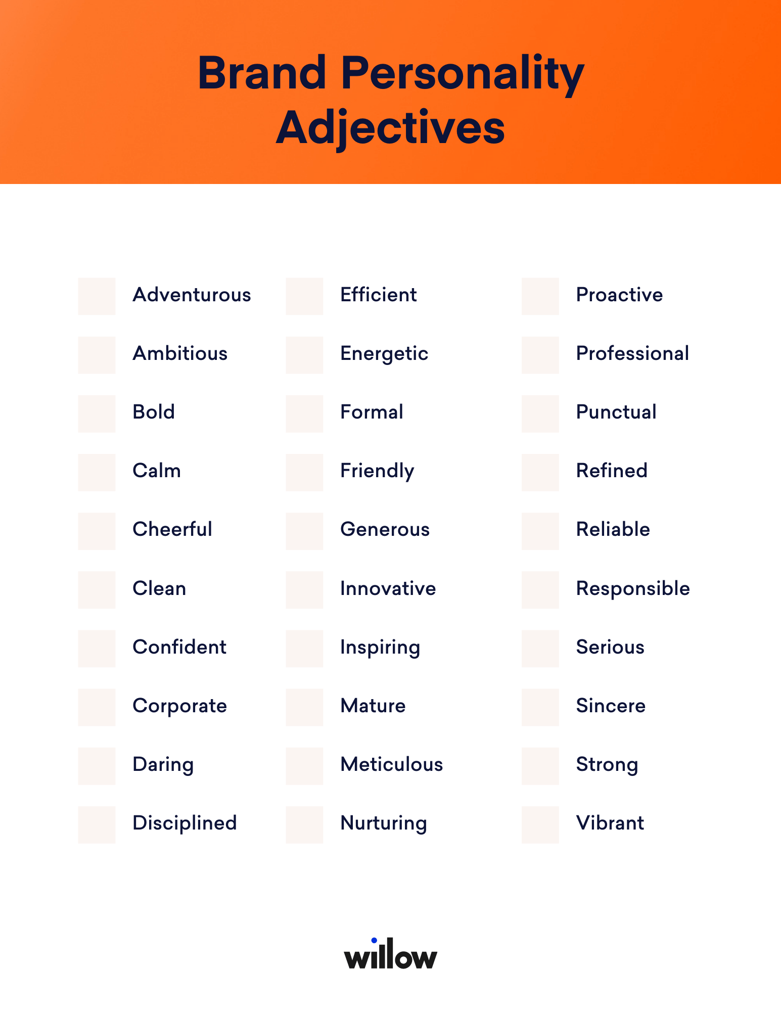
Choose 3-5 adjectives that describe your brand's character. But avoid generic terms like "trustworthy" or "professional" because every brand claims these. Pick traits that differentiate you. Are you refreshingly direct? Quietly confident? Playfully serious?
Triniti Solutions' Rick and Danny Zwart developed a confident, straightforward voice on LinkedIn that matched who they actually are. Their audience responded because the content felt authentic.
Your verbal brand includes your tone of voice, your brand values, your mission, and the language patterns you use consistently. Write these down and share them with anyone who creates content for your company.
Your visual brand
Your visual brand is how your content looks: your logo, colour palette, fonts, and image style. These elements should reflect and reinforce your verbal brand. A playful brand shouldn't have a corporate colour scheme, and a serious professional firm shouldn't use whimsical fonts.
Colour palette: Choose 2-3 colours that reflect your brand personality. Blue communicates trust. Orange communicates warmth and energy. Green signals growth and sustainability. Apply these colours consistently across your social posts, website, and marketing materials.
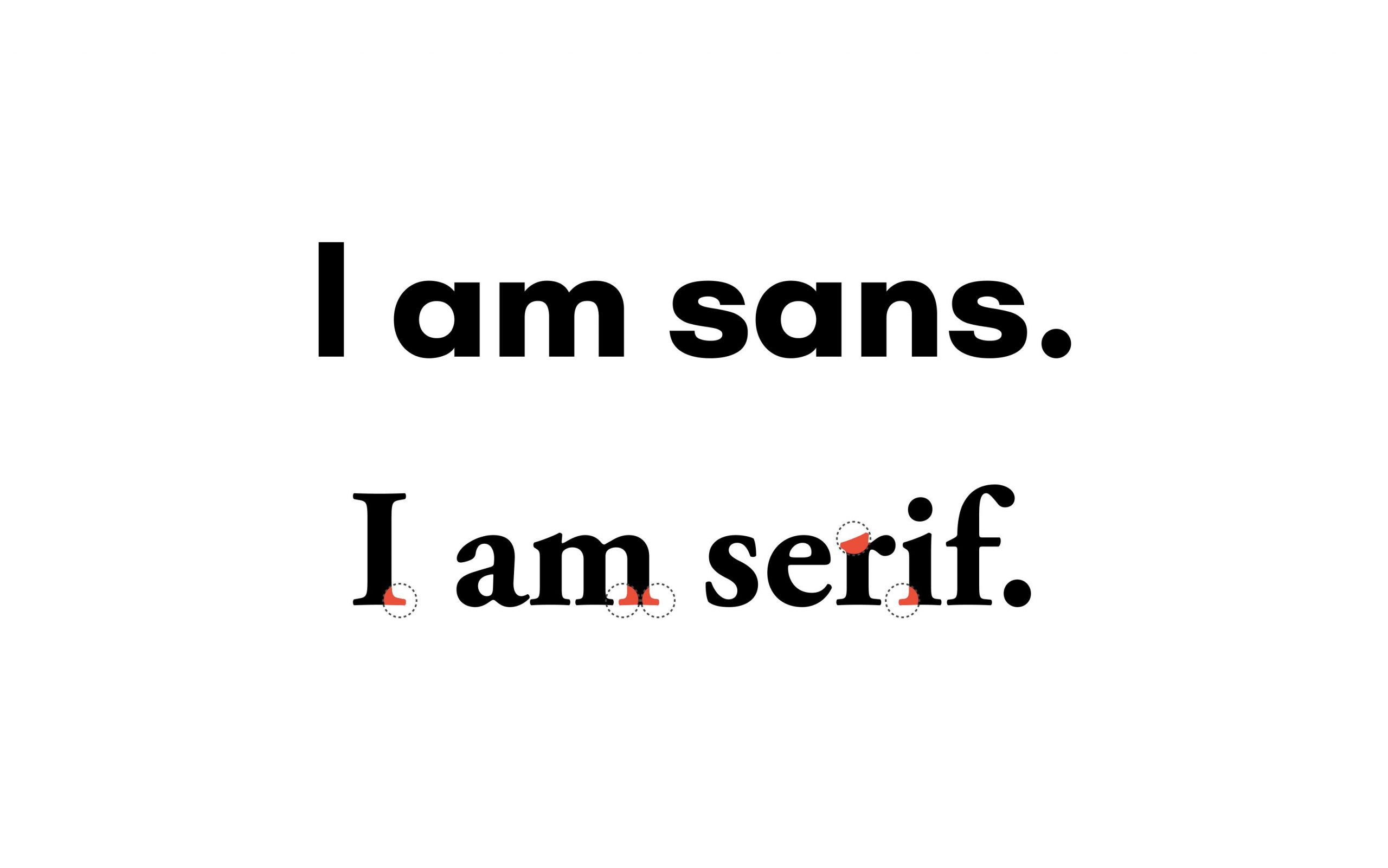
Fonts: Pick 2-3 fonts. Sans-serif fonts (like Helvetica) feel modern and clean. Serif fonts (like Georgia) feel classic and established. Pair one for headlines and one for body text. Consistency in fonts makes your content recognisable at a glance.
Images and graphics: Define a visual style that matches your brand. Do you use real photography or illustrations? Bright colours or muted tones? Professional shots or casual smartphone photos? Whatever you choose, keep it consistent.
Altro Vastgoedgroep manages multiple brands through Willow's tailored dashboards, maintaining distinct visual identities for each while keeping everything coordinated from one platform.
How they work together
Your verbal and visual brand should tell the same story. A playful tone with corporate visuals creates confusion. A serious voice with casual, colourful graphics feels inconsistent. When both align, your audience builds a clear, strong image of who you are.
Consistency builds recognition. When people see the same colours, tone, and style across every post and platform, they start to recognise your content before reading a word. That recognition builds the familiarity and trust that ultimately drives business.
Use Canva to create templates with your brand colours and fonts, so every post looks cohesive. As your brand matures, consider working with a designer to create formal brand guidelines that keep everything aligned across your team.